Happened upon these charts whilst looking to buy some property in the Black Hills area. Hard to find Price to Rents data in the more rural parts of South Dakota. Most of them come from Harvard's Joint Center for Housing Studies "State of Housing" Report. The report itself was superb until about half way through it they totally started taking this typical leftist, academian slant, tailoring the report to show how minorities are lagging behind their white counterparts, and woe is them, and oh if we only gave minorities more of a leg up, blah blah blah.
Regardless the charts are good, my favorite of which is at the bottom;
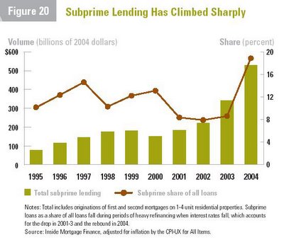
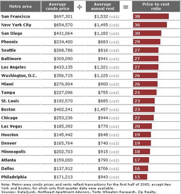
This one is scary as hell.
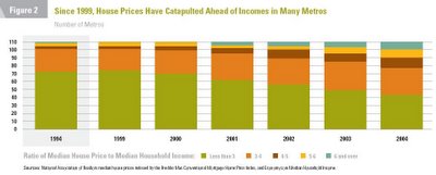
This doesn't make things look better.
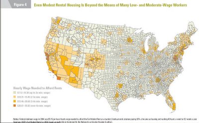
This tells me that morons live on the coast...but if you looked at voting pattern chart of the US, it would tell you the same.
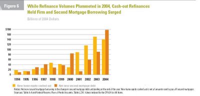
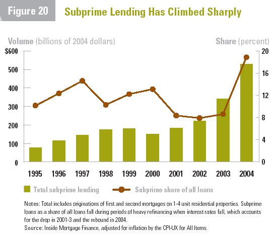
This just tells me there's a lot more people applying for HEL's and ARM's to finance their trailer home or mobile homes.
This tells me I should move my tiny white ass out of this bitch ass cold state and move to Atlanta and find me a southern belle.
 This doesn't make things look better.
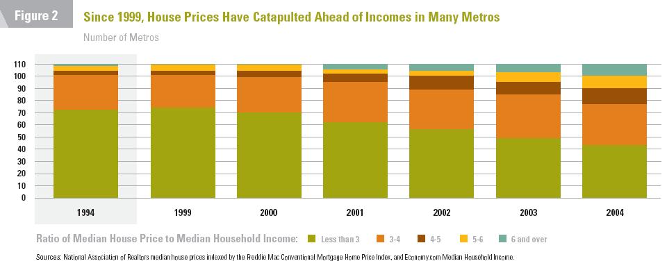 This tells me that morons live on the coast...but if you looked at voting pattern chart of the US, it would tell you the same.
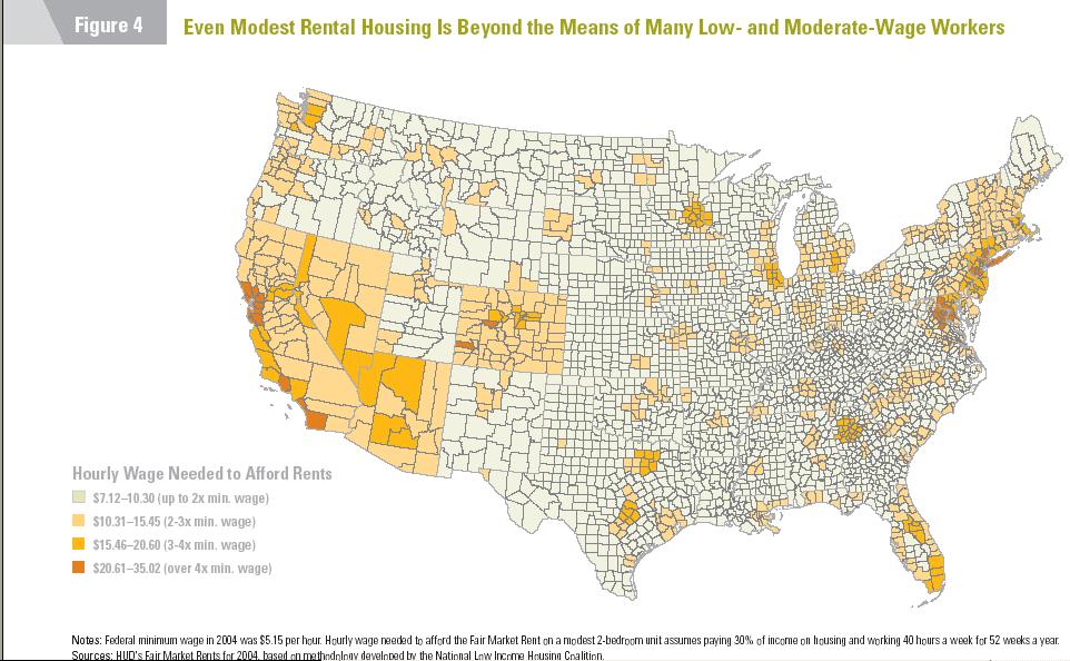
 This tells me I should move my tiny white ass out of this bitch ass cold state and move to Atlanta and find me a southern belle.
No comments:
Post a Comment