As some of you know, my sister is a communist. Of course, this isn't her fault as she is currently pursuing her doctorate at UC Berkeley and if she were not an avowed communist, they'd shoot her.
That being said, it brings a tear of pride to my eye when I see the little aspiring economist in her send me a chart like this;
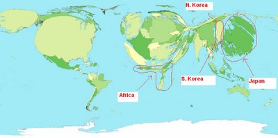
This is a "cartogram."
Sure, whatever.
But what is neat about it is that it magnifies each country by the size of its GDP.
Couple interesting observations;
1. Africa. Good lord, it's as skinny as the people, large amount of land, very little GDP.
2. North versus South Korea. Can you see that sliver on top of South Korea? Yeah, that's North Korea. If there's a visually stunning argument against communism, there it is folks.
3. Japan. You might at first mistake it for China, but if you look closely, it is an island. It's just that Japan's economy is so big that it once again distorts its geography.
4. When comparing Japan against China, it shows Japan bigger than China. This leads me to believe that they are NOT using PPP adjusting GDP figures. Sloppy sloppy sloppy.
No comments:
Post a Comment